I analyse top 100 articles! So you don't have to GRAPHP*RN#2

Top 100 articles analysed! GRAPHP*RN#2

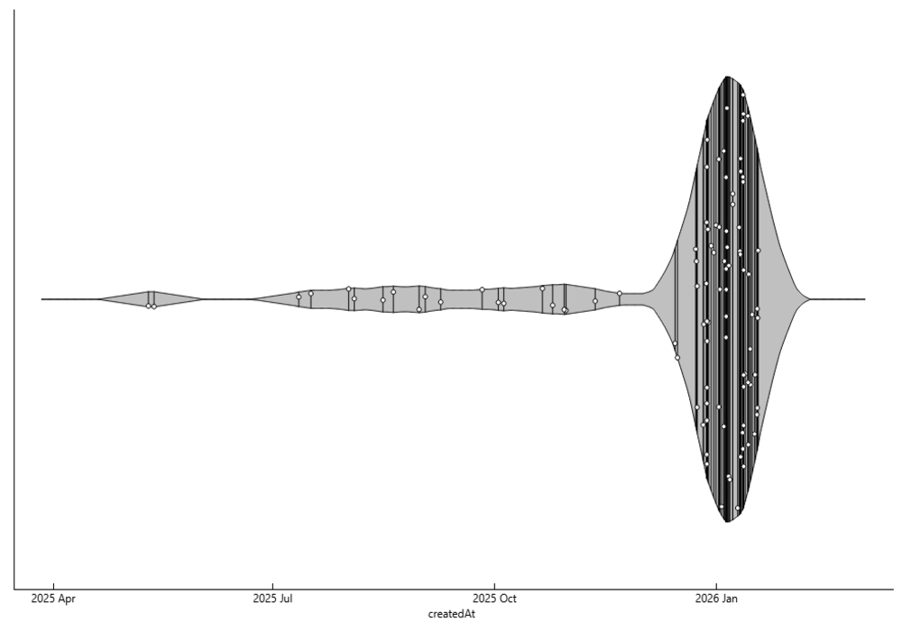
A Beautiful Surge: A Community Growing Stronger!
The elegant spike in January 2026 is a visual celebration of our expanding community. That dense bloom of activity reflects the incredible momentum we’ve built together in recent times.
It’s new members joining, fresh content being created at a rate…. Well never seen before
Congrats guys! and Let’s keep the rhythm going and make the next chapter even more vibrant!
The Graph Mechanics
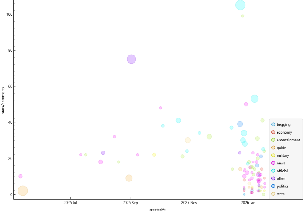
This bubble chart offers a dynamic snapshot of article engagement over time. Here's how to read it:
X-axis - (Date Created)
Y-axis - (Number of Comments)
Bubble Size Indicates the number of views—larger bubbles mean more eyes on the article.
Color Coding: Each bubble is colored based on its category
What we get to know?
As the community continues to grow, article engagement is clearly on the rise.
A few interesting points.
Stats have High number of views, but lesser comments.
Updates from developers consistently receive warm support. The community’s trust in the dev team is evident, and these posts reinforce their strong reputation.
Most articles in the top 100s are of news category.
Memes, jokes, and playful content tend to provoke reactions—whether laughter, debate, or appreciation. This might be the reason behind higher comment rates.
The top 100 articles were crafted by 61 different users!

Graph Mechanics
X-axis - (Categories)
Y-axis - (Number of Subscribers Gained)
Bubble sizes reflect the number of views received—larger bubbles mean more visibility.
Color coding is based on language.
Some Interesting Points
I, a writer of statistical articles, am personally surprised to see more of begging articles in top 100s than stats ones.
Entertainment and news dominate the scene!
Great guide articles have very high views and high subscriber gains.
One Russian article has made it! Along with a few Spanish and Portuguese ones.
YOUR SUPPORT MATTERS TO US❤️
Sooo.....
What r u waiting for?
LIKE, Subscribe AND KEEP ON YAPPIN'!!!