WarEra+ v1.3 - The map finally moves, new visuals and wallpaper engine!
It's me again, /user/69d2ed249f38d300d59a2af1. A little over two weeks since v1.2 https://app.warera.io/article/6abba297147997b526b66cdd, and the v1.3 has a different thread. The last release was about what the game forgets. This one is about what the game shows you standing still, and that actually moves: players changing country, money going from one treasury to another, a battle swinging minute by minute, a world that was different yesterday.
As always, a good chunk of what follows started from your messages: phone tables, the Back button, the labels that overlapped on the map. If you recognise a sentence, you probably wrote it.
Same map as ever: https://wareraplus.vercel.app/, free, no login.
AAAAnd, wait a bit for the gifs in the article to load!
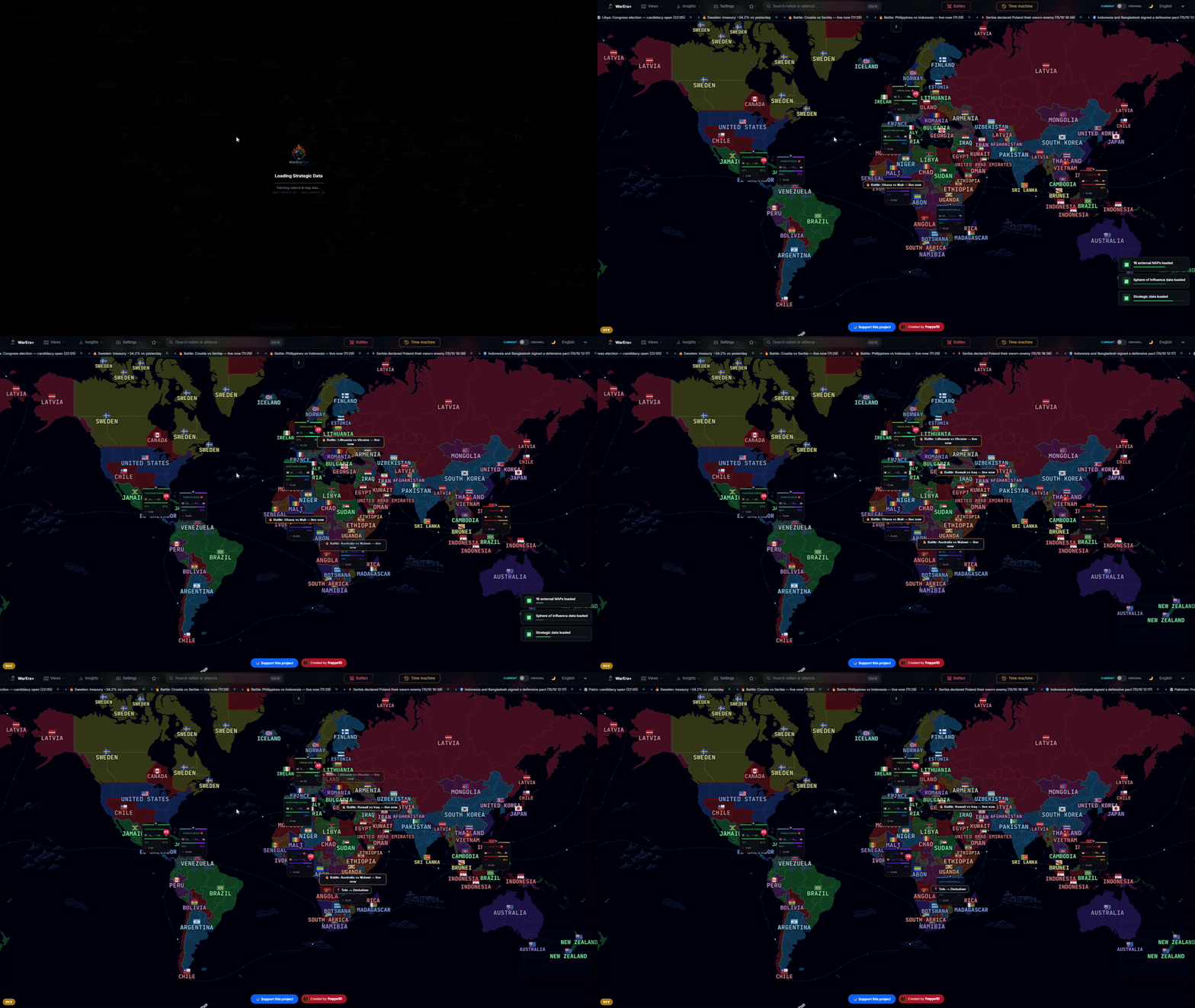
The world moves. Now you can watch it.
Migration: where players go
The Map views menu has a new entry, Migration. Every nation is tinted by its net balance of players who changed citizenship: red if it loses them, green if it gains them, in absolute numbers or per 100 citizens. They're two different questions: minus ten on a nation of three hundred isn't minus ten on a nation of three thousand.
Click a nation and the part I like best starts: curved arrows towards the countries its players are moving to (orange) and from which new ones arrive (blue), with little comets running along them and a straight shadow on the ground, so on a flat map you get the feeling of a flight. The arrows start and end at the capitals, not at a random point. The side panel has the summary by partner: who it trades players with the most.
And it isn't just the total. Below the summary there's a day-by-day slider over the last 30 days: click a bar and the map shows that day, press play and the days scroll by one per second. You see things you'd never notice otherwise. On 3 and 4 October 16 and 17 players left /country/6813b6d446e731854c7ac7a2: 27 of those 33 went to /country/6873d0ea1758b40e712b5f76.
Honest limit. Only players from level 10 up are counted, and the days before the archive started watching are a gap, not a zero. The view says so.
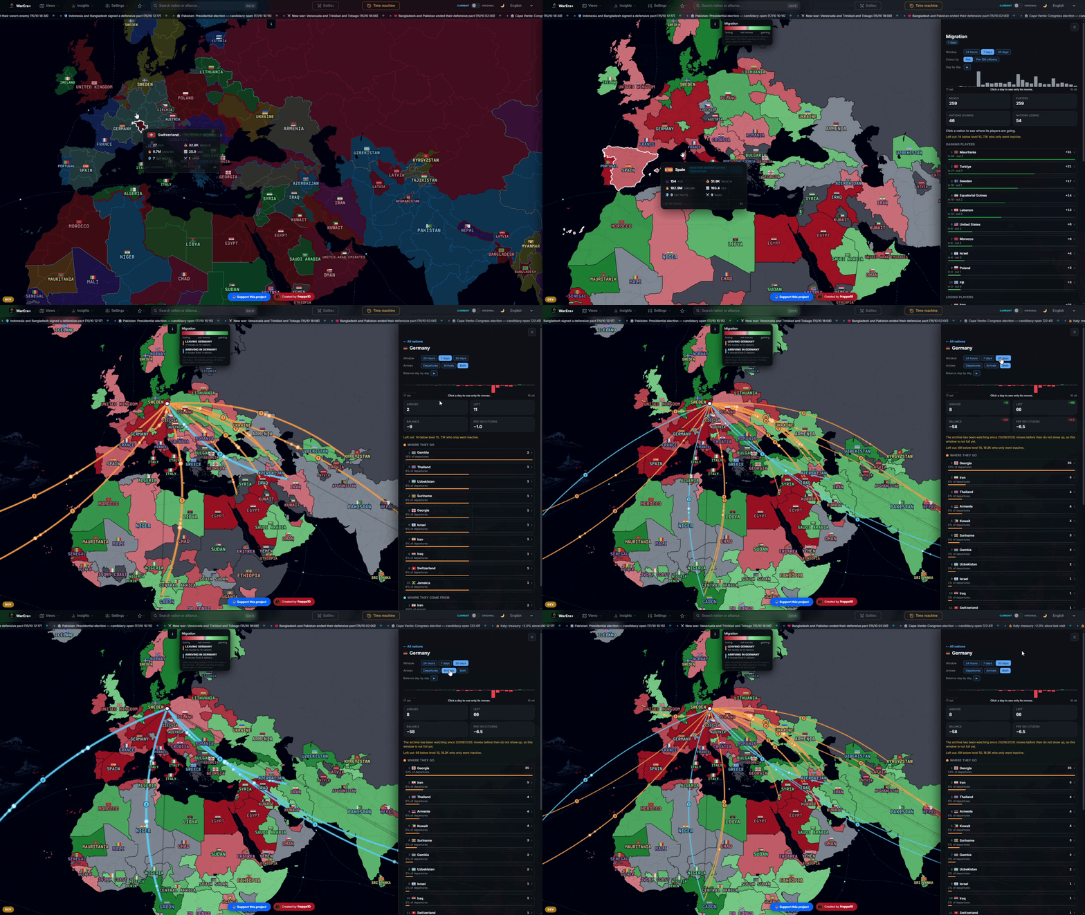
Who left, where to, and on which day.
Funding: money between treasuries
Same idea for transfers from treasury to treasury. The new Funding view tints the map by balance: gold for those who receive more than they send, purple for those who give. Choose 7, 30, 90 days or the whole archive, which starts on 25 April.
Click a nation and only it and its partners stay coloured, with arcs from those who fund it and towards those it funds, and gold coins running in the direction of the money, more of them where more money goes through. The panel lists who receives and who gives the most, the biggest flows and, for the nation you picked, its partners with their share. Where the server doesn't have the data, the view falls back on what the game's API remembers on its own (about three days) and says so, instead of passing a hole for "nobody funded anybody".
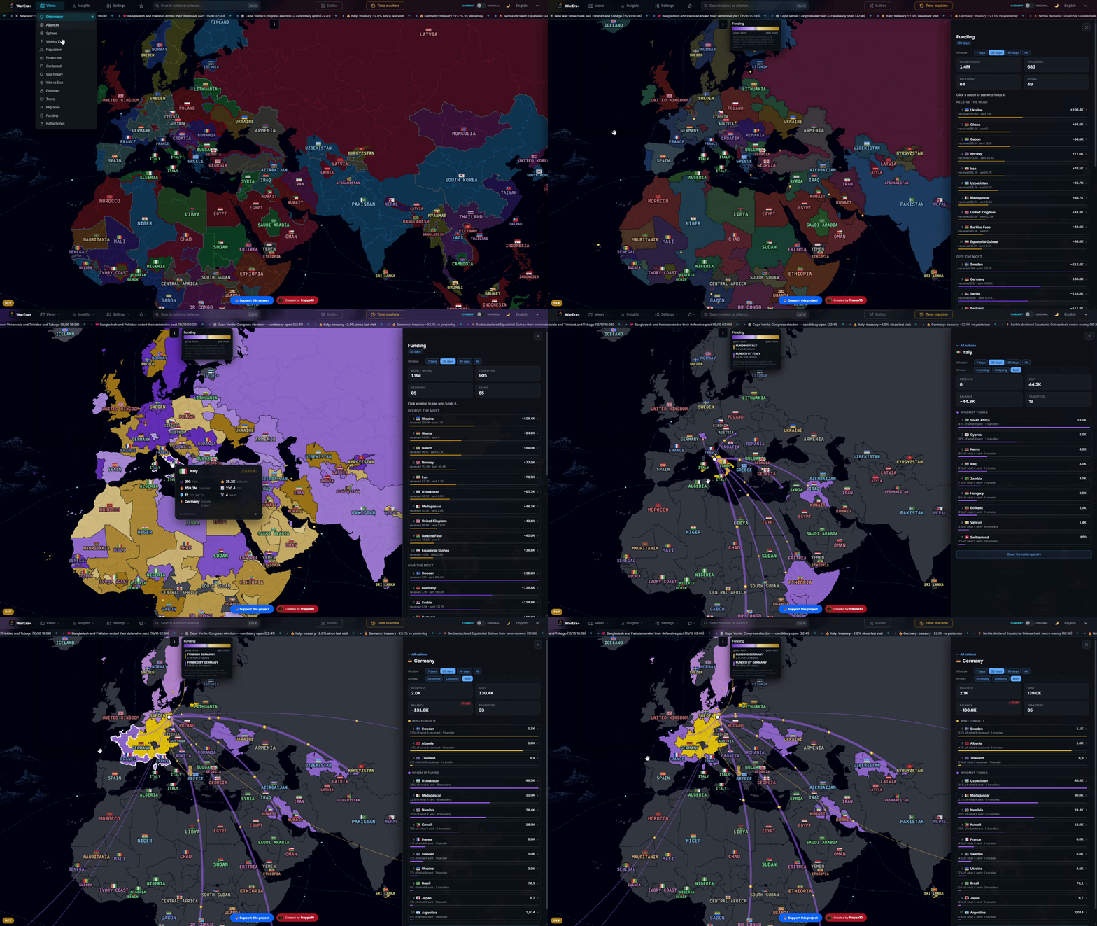
Follow the money, literally.
Battle bonus: where is it worth fighting?
The damage bonus you get in a battle depends on who you are: citizen of one of the two sides, member of an alliance, defensive pact, sworn enemy, orders from your nation and your unit, unit headquarters, bunker or military base, revolt, region cut off from the capital. They're all over the game, and adding them up in your head during a round isn't anyone's idea of fun.
So there's one more map view: Battle bonus. Pick it, click a battle and every nation takes the colour of the highest bonus its citizens would have there: blue if defending pays, red if attacking pays, fuller the higher it is, grey for those with no bonus of their own. On each nation, the name and a "+62%" in the colour of the side.
The panel has the full picture: the battle's facts, the nations where defending pays and those where attacking pays, with the detail line by line, and your own bonus if you've set "This is me". The same is inside the battle, in the Bonus tab (open battles only), with two switches to add by hand your unit order (high, medium, low) and your unit headquarters (level 1 to 4).
Honest limit. The percentages come from the game's own configuration, I didn't invent them. But bunkers and bases received from an ally are an estimate (half, when you share an alliance), and the total is a sum: the tool says so, and so do I. It's for open battles only: for finished ones, orders and buildings can't be known any more.
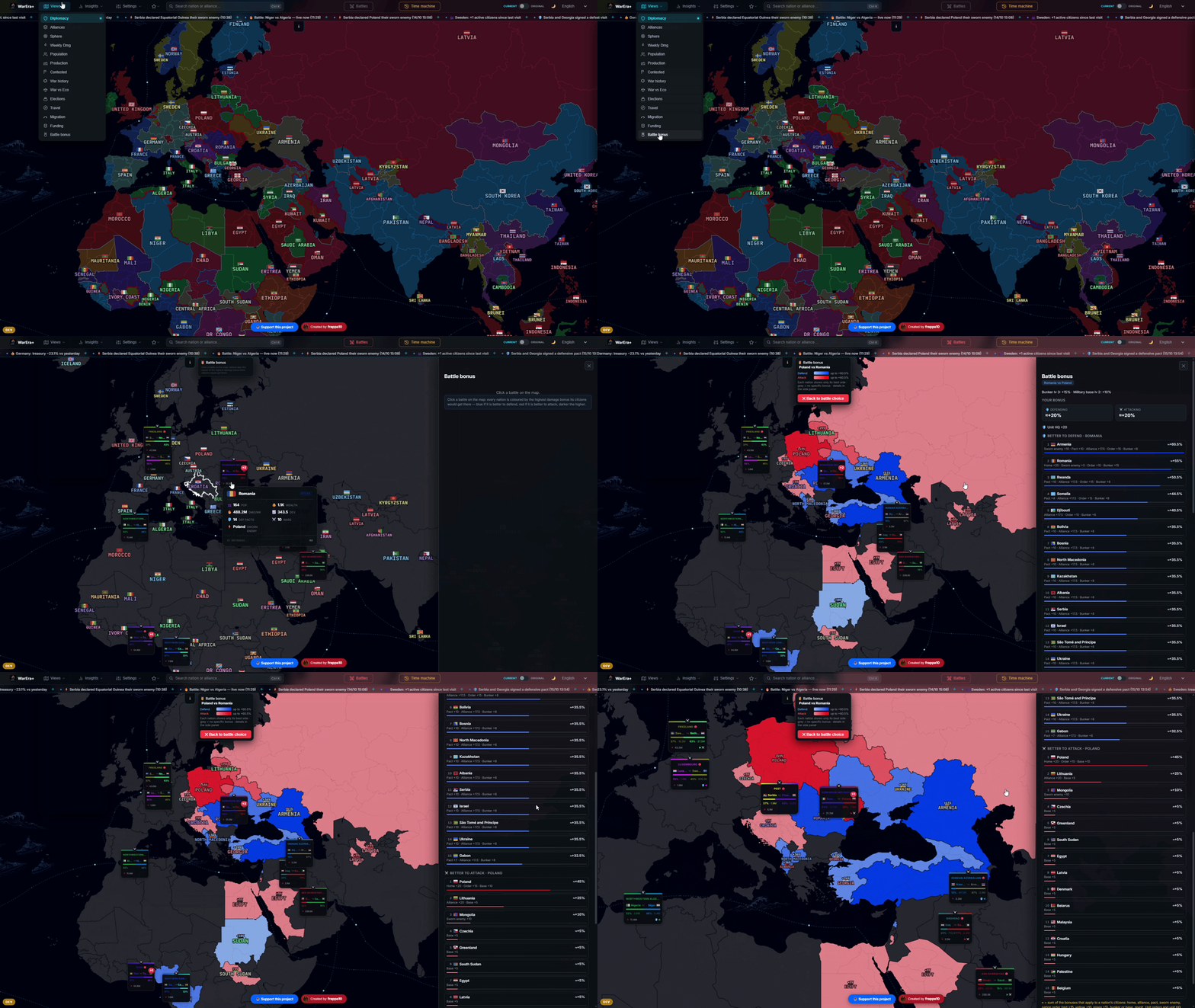
Not just how hard they hit. Where it pays to be.
Reading a battle, minute by minute
The game doesn't keep the history of a battle: it holds the last hits and the final rounds. So I made the server record it: one sample per minute of damage and round points for each side. Since 7 October, when you open a battle you get the Timeline section: the chart, the list of lead changes with who pushed in the ten minutes before, and the time each nation joined.
And that chart is also a replay on the map. Open a recorded battle, press the replay button and the map relives the fight: heatmap, labels and arrows follow the clock, at three speeds (the whole battle in 60, 30 or 15 seconds). On the slider there are marks for lead changes, in the colour of whoever takes the lead, and a little flag when a big nation joins. Click a mark and you're there.
The rest of the card has been rearranged too. It used to be a wall of sections; now the summary stays on top and below it there are buttons: Nations, Alliances, Military units, Timeline, Funders, Contracts, Bonus, one section at a time, no data removed. Nations, Alliances and Units also have Round 1, Round 2… buttons to read the rankings round by round, with the winner and the points on the closed rounds and the current one in red. Alliances are split into their nations, and they're the alliances at the moment the battle began, not today's, because in ninety days quite a few nations change bloc.
An open battle now refreshes by itself every tick (two minutes), without switching tab or closing your tables, and tells you the time of the last reading.
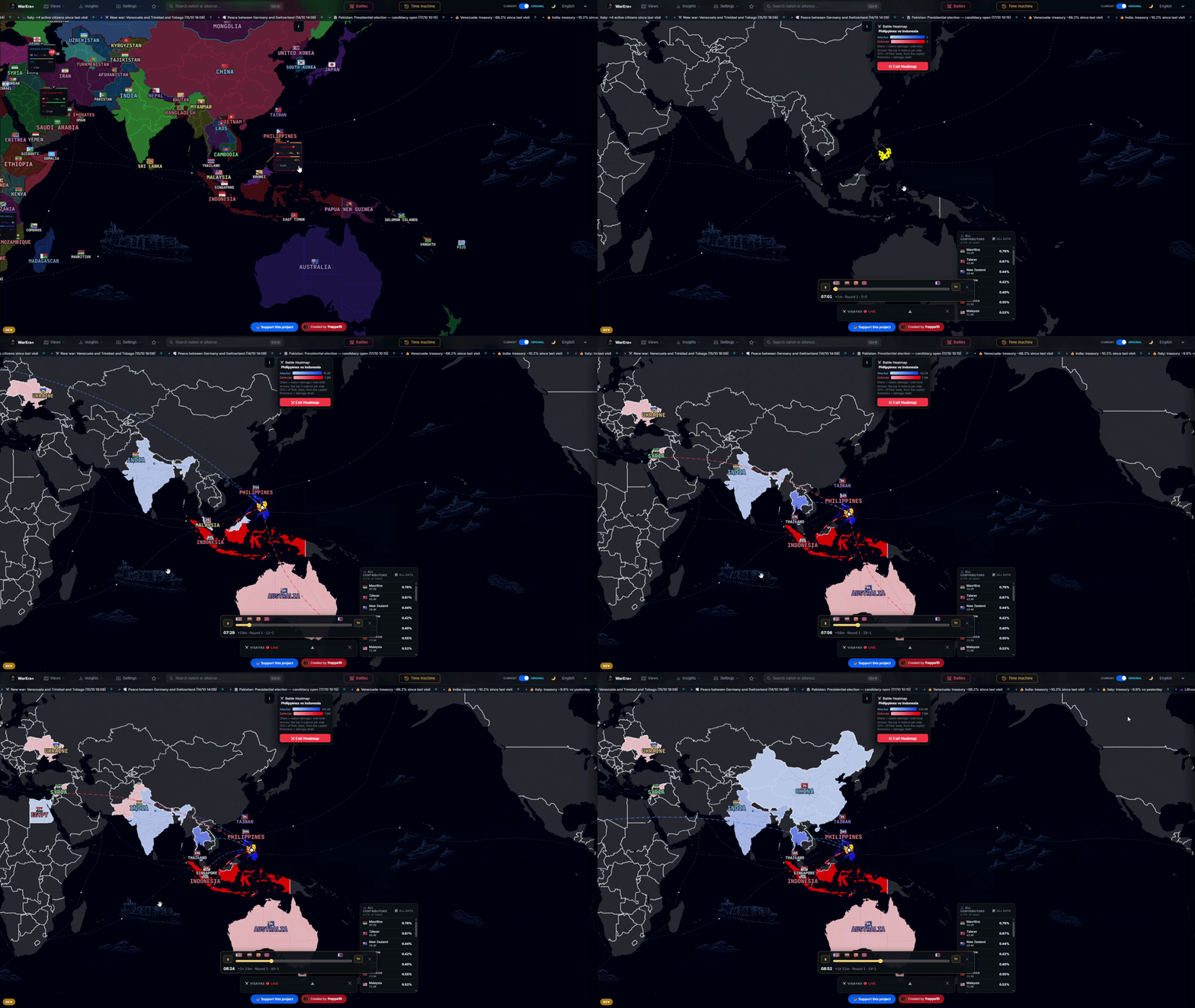

A battle is a story. Now you can read it from the start.
A time machine that tells stories, and a map that's alive
The time machine used to show. Now it tells. When a region changes hands between two days, an arrow leaves the conqueror's capital and a wave spreads over the region. Pick a nation and arcs appear towards those it was at war with that day (red), its sworn enemy and its defensive pacts (purple); and the battles of the day as arrows from the attacker to the region, as thick as the damage. Only the eight heaviest ones, or only those where the nation you picked fights: the first version drew thirty or forty of them and you couldn't make anything out.
And above all: it no longer stutters. Every frame was sending the map all 726 regions again, about 100 milliseconds of work, and the map was always a step behind the slider. Now it only rewrites where something actually changed. The speeds are 0.1×, ¼×, ½×, 1× and 2×, and you start at ¼×, because at full speed it was more a slot machine than a story.
The normal map is alive too. Every ticker event makes a ping where it happens: orange waves for a new battle, waves in the colour of the new owner for a region that changes hands, a pulse running between the two capitals for a war, a peace or a pact. Click a news item in the ticker or in News and the map flies to the spot. Labels of nearby pings come out staggered instead of piling up: someone sent me a screenshot of exactly that, and they were right. Over a 25-second test, overlapping labels went from 27 samples out of 97 to 0 out of 95.
Elsewhere: in the Damage view the capital of every nation has a beating heart, bigger and faster the more damage it did in the last hour; in Spheres of influence there are threads from the power to its proxies (solid if the link comes from the CSV, dashed if it's a radar estimate); in Elections the map is tinted by turnout and, when a vote closes, a wave in the winning party's colour with its name; in Travel you can now "run the loop" with a marker, stamina emptying and cases counted.
If all this moving bothers you, or your phone is sweating, there's an Animations switch in Settings: it stops comets, coins, pulses and pings. Arrows, colours and labels stay.
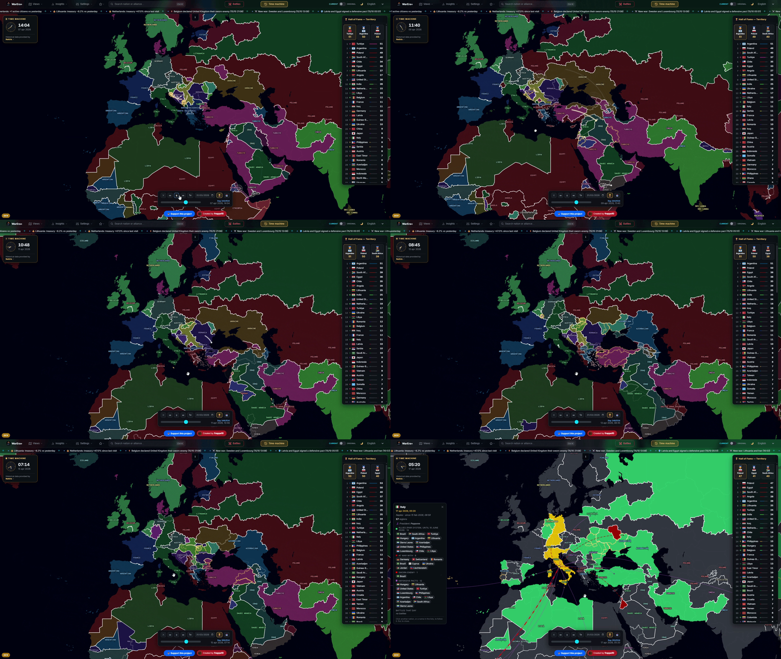
A map that doesn't wait for you to refresh it.
Pills: how many, quarter hour by quarter hour
On the nation page, above the damage-over-time chart, there are now three numbers: players on a pill right now, players on a pill 24, 48 or 72 hours ago (it follows the window you picked) and the difference, in number and percentage. To do that the server remembers the exact time of every pill for fourteen days, so the pill line moves every fifteen minutes up to now, and the windows reach 7 and 14 days. The same data is in the group charts: alliance, Faction 1 vs 2 and the comparison between two nations.
Where the record doesn't reach that far back, the tool compares the last closed hour with the same hour of the window and says so: the difference is always between two numbers of the same kind. (And one thing that was wrong: in a first version "on a pill right now" showed 39 when it was 49. Fixed.)

Players: a whole section
Under Insights there's a new entry, Players. Search by name, "This is me", recently viewed, and the world rankings (weekly damage, total damage, wealth, bounty), filterable by nation.
A player's page tells you who they are (nation, unit, level, build, pill), their numbers with their position in the world and in their nation, and three tabs: Battles, Wealth over time, Skills and equipment. It has their companies with 31 days of production and wages, their politics (party, offices, party switches) and the loot of every battle. In Nation statistics, clicking a citizen now opens this summary instead of taking you to their game profile (Ctrl-click or middle click still opens the game).
Then the 1 vs 1. "Compare with…" on a player's page and the two face each other, each in their own colour, a VS in the middle, the score of the rows won and a crown on whoever is ahead. Every row is a tug of war: the two values on the sides and a bar split in proportion. Skills are a radar with the two profiles overlaid; equipment, slot by slot. The link of the comparison can be sent to anyone.
Honest limit. The wage a player earns working for others is nowhere in the game's API, so the work numbers are the sum of their own companies, and the view says it. And a player's battles don't have a procedure of their own: I look for them in open battles and in those closed in the last three days, with a "search further back" up to 31.


Two players, one scoreboard.
Military units and nations: more comparisons, less scrolling
The Military Units menu has a ⚔ 1 vs 1 tab: two units against each other, with the same look and rules as the comparison between nations, because two different ways of reading a comparison would have been a mistake. "A against B" bars, the winner of each row in bold with its advantage (+8%, ×4.4), and on top the scoreboard of who is ahead in how many measures. From a unit's page, "⚔ Compare" takes you there with that unit already picked.
Nation statistics had a height problem: Italy's page was about 14,500 pixels long. Now the metrics stay on top and below them there are tabs: Play style, Damage over time, Labour and taxes, Citizens, one at a time. The longest one, Citizens, shows the first fifty by the order you chose (which still applies to the whole list) with "show all".
And Economy has two more tabs. Production is a nightly census of companies: for each resource, how many companies of active owners, how many with employees, how many employees, and wages and wage taxes per day, with a nation filter. Player wealth is a player's wealth curve day by day, with best and worst days and the world position.
Honest limit. For Production I limit the wages rebuilt backwards to seven days: at thirty, the curve showed a +70% in tax revenue in a month where it hadn't happened.

The Back button, and links that go where they say
This is one of those things that, once you notice it, you can't unsee: the tool is a single page and nothing touched the browser history, so "Back" (the browser's, the Android gesture, the installed app) threw you out of WarEra+ whatever you had open. Now it closes the thing that's open: the battle, the card, the view, the time machine, the highlighted nation, then it leaves. One level at a time.
And the address bar now follows your navigation: map view, nation, alliance, sphere, battle, section and card, unit, player, comparison. All of it goes into the URL, and that link reopens exactly the same thing: send it on Discord and the other person lands on the same battle or the same comparison. The old ?country= and ?tm= links work exactly as before, because they're already inside many articles.
WarEra+ on your desktop
One thing that isn't a feature of the site but of your PC, and that has been live since 12 October: a Wallpaper Engine wallpaper. On the Steam Workshop it's called WarEra+ live map: the strategic map as your desktop, with alliances, wars, live battles, elections, damage, migrations and funding, the news ticker and the pings on the map. From the wallpaper's properties you pick the view, a rotation between views, the framing, a nation, theme and language, and you can switch on or off animations, battles, alliance names, ticker and menu bar. You can also add your own WarEra API key, so the data comes straight from the game on your key.
Link: https://steamcommunity.com/sharedfiles/filedetails/?id=3818208882. The visits counter at the bottom of the site is now a single pill: visits | online (tool and wallpaper) | wallpaper subscribers.


A map you don't have to open.
Under the hood
Lighter start. Data starts in parallel and the map file went from 16.4 to 3.2 megabytes (-22% across the five start-up files). Before, good data was thrown away for part of the cycle and every user fell back on a direct call to WarEra: not any more.
A faster server. The ticker summary went from about half a second to a tenth, and identical requests that arrive at the same moment become a single one towards WarEra: the shared key has a single cap for everybody.
History that builds up. The damage of a past day exists nowhere in the game, so the 02:00 snapshot is now appended day by day. There's no view that shows it yet; there's an archive that in a few months will be worth a lot.
Reserved area. I also reorganised the governments' page: same data as before, but with what matters right now on top instead of sixteen identical boxes.
Bug fixes
Battles with many contracts showed wrong numbers. The game returns at most fifty contracts per page and I was reading a single one: on the /country/6813b6d446e731854c7ac79a–/country/6813b6d446e731854c7ac7a2 battle of 13 October (/battle/6acdc9db60e2c1d492069794, 169 contracts), the "of which contracts" column gave 5,162 for the French side against the real 30,232, and 4,086 for the Italian one against 21,614. Now I read them all, and if I ever cut them off I'll say so.
"New alliance" did nothing in some browsers, because the system dialog doesn't exist everywhere. Now the name is asked in a window inside the page.
"Our strength" could show pills from a day and a half earlier: if nobody had looked for over an hour, the view settled for the last reading and never asked again. Now it re-reads by itself every ten minutes.
Pills counted twice, and damage charts frozen at the hour you opened them (fixed on 29 September, just after v1.2).
Bounty and contracts. The "money" ranking already contains the contracts and they were being added up twice; and in battle spending the bounty now goes to the belligerent, with who sent them money.
A battle card running off the screen, with war spending open on a short window, with its header ending up under the top bar.
Political could hang on opening. A second election request within 300 ms of the first left the first one waiting forever, and with it the start of Political when you opened it straight from a link.
As always, everything is on https://wareraplus.vercel.app/, free and with no login (reserved area aside). If something doesn't add up, or there's a question you'd like the tool to answer, write to me: half of this article came from there.
/user/69d2ed249f38d300d59a2af1
